MAI Portal Redesign
Shipped
B2B Portal
EdTech
MAI Portal: Designing for a Growing B2B Platform
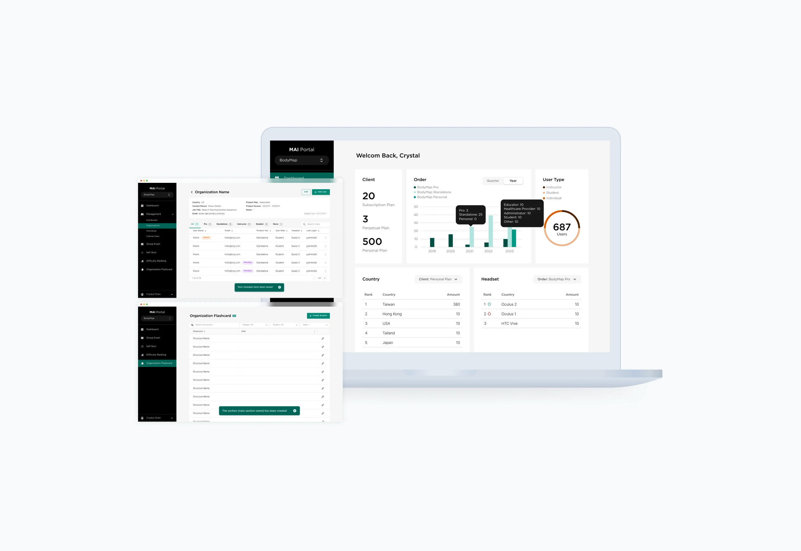
TL;DR
MAI Portal brings MAI’s medical education products and management tools into one platform. I designed management workflows and helped build its design system, including flexible admin access, navigation tailored to user access, and reusable UI patterns. These designs and guidelines shipped as part of the portal.
Role
UX & Visual Designer
Team
3 Designers, 1 Frontend Developer, 1 Full-Stack Developer
Duration
3 months (Dec 2022 - Mar 2023)
Scope
B2B Product Design; Design Systems
Background
A portal expanding beyond its original structure
MAI Portal grew from a single admin tool into a platform serving multiple users and organizations. As roles and features expanded, three parts of the experience became harder to maintain:

Instructor dashboard in BodyMap Analytics, before MAI Portal
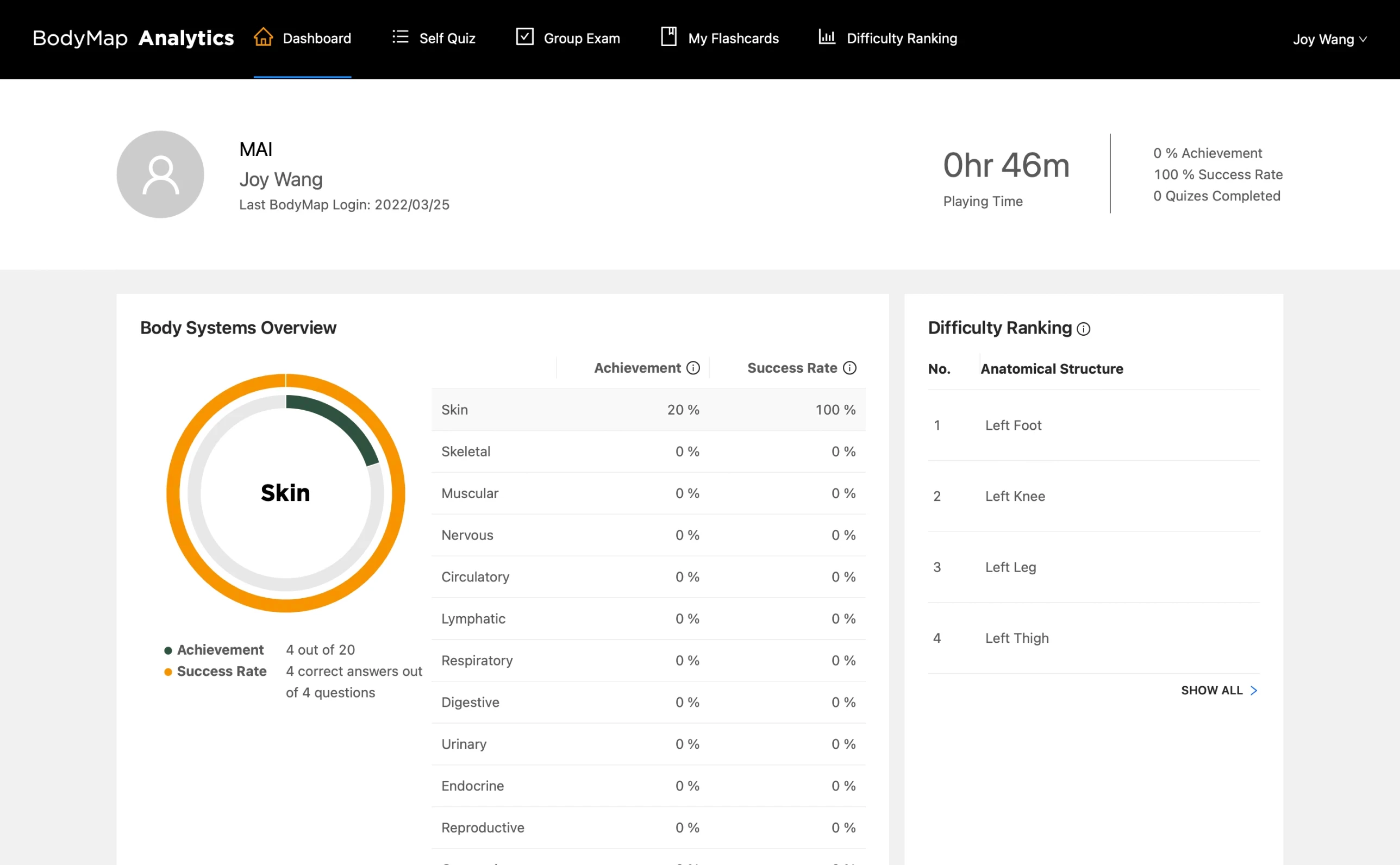
Student dashboard in BodyMap Analytics, before MAI Portal
The solution
A portal structure designed to grow
We created a more flexible foundation for managing access, finding relevant features, and building consistent workflows.
Design decisions
01 Separate capability from role
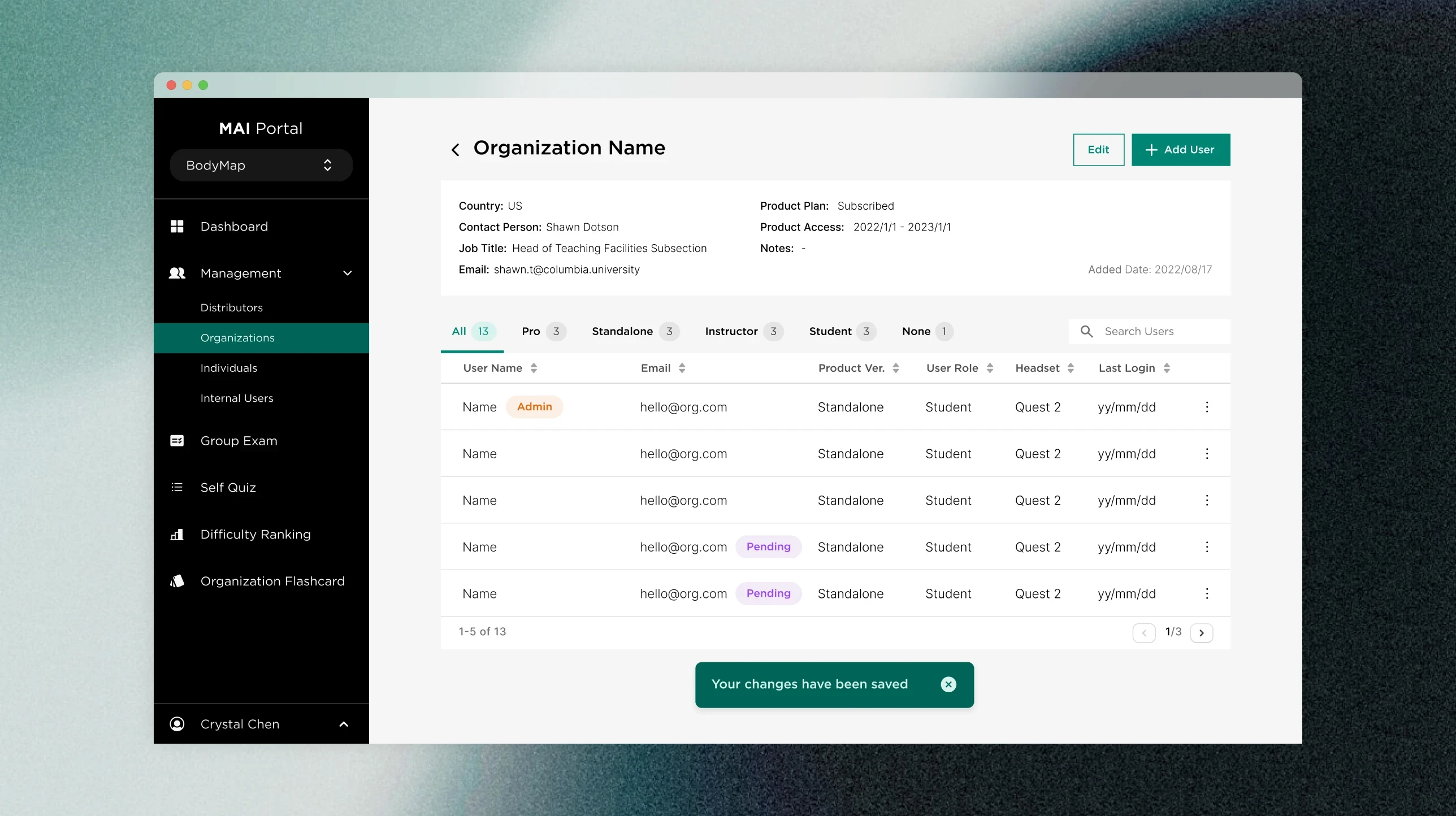
As management responsibilities grew, fixed roles could not cover every combination of access. We introduced an Admin Tag so a user could gain administrative capabilities without changing their primary role. I mapped the account hierarchy to define how this worked across MAI, distributors, and institutions.
02 Shape navigation around access
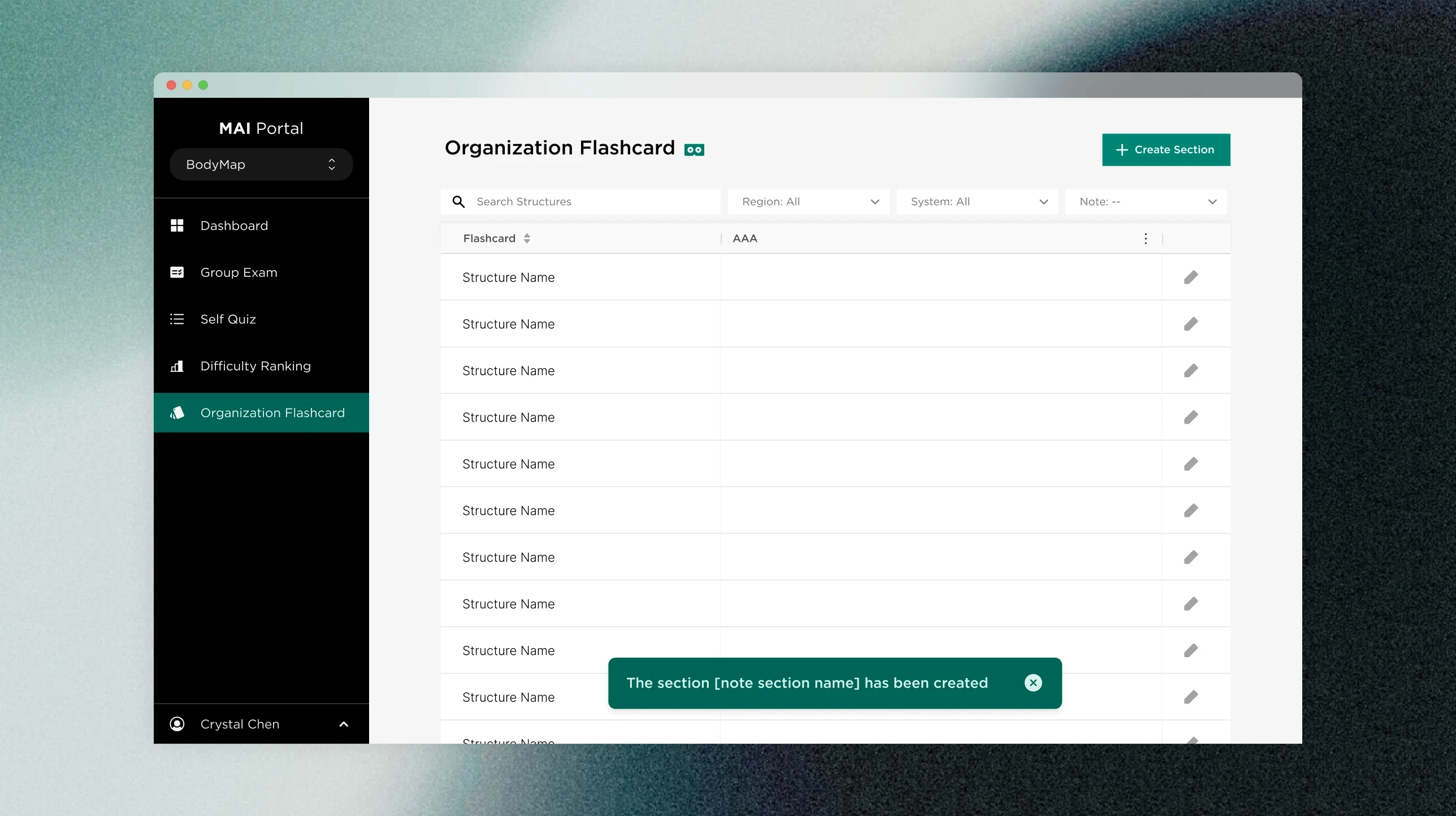
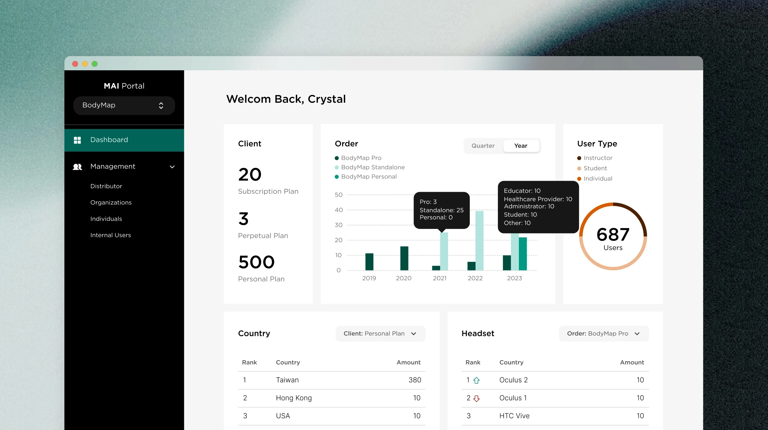
Students, instructors, and administrators needed different parts of the portal. I mapped their available features and helped design a modular sidebar that showed relevant destinations while keeping the navigation structure consistent.
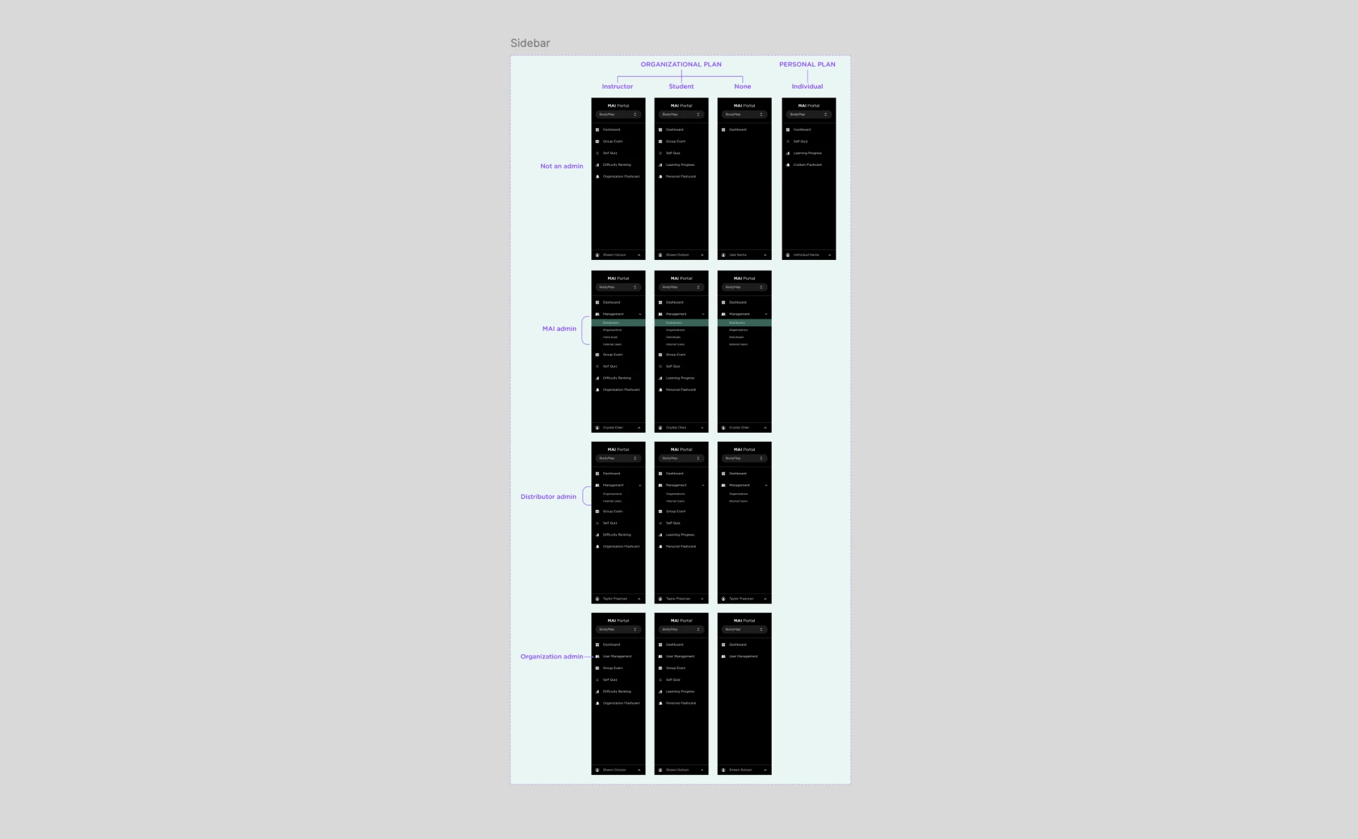
Mapped sidebar navigation for different plans and admin roles
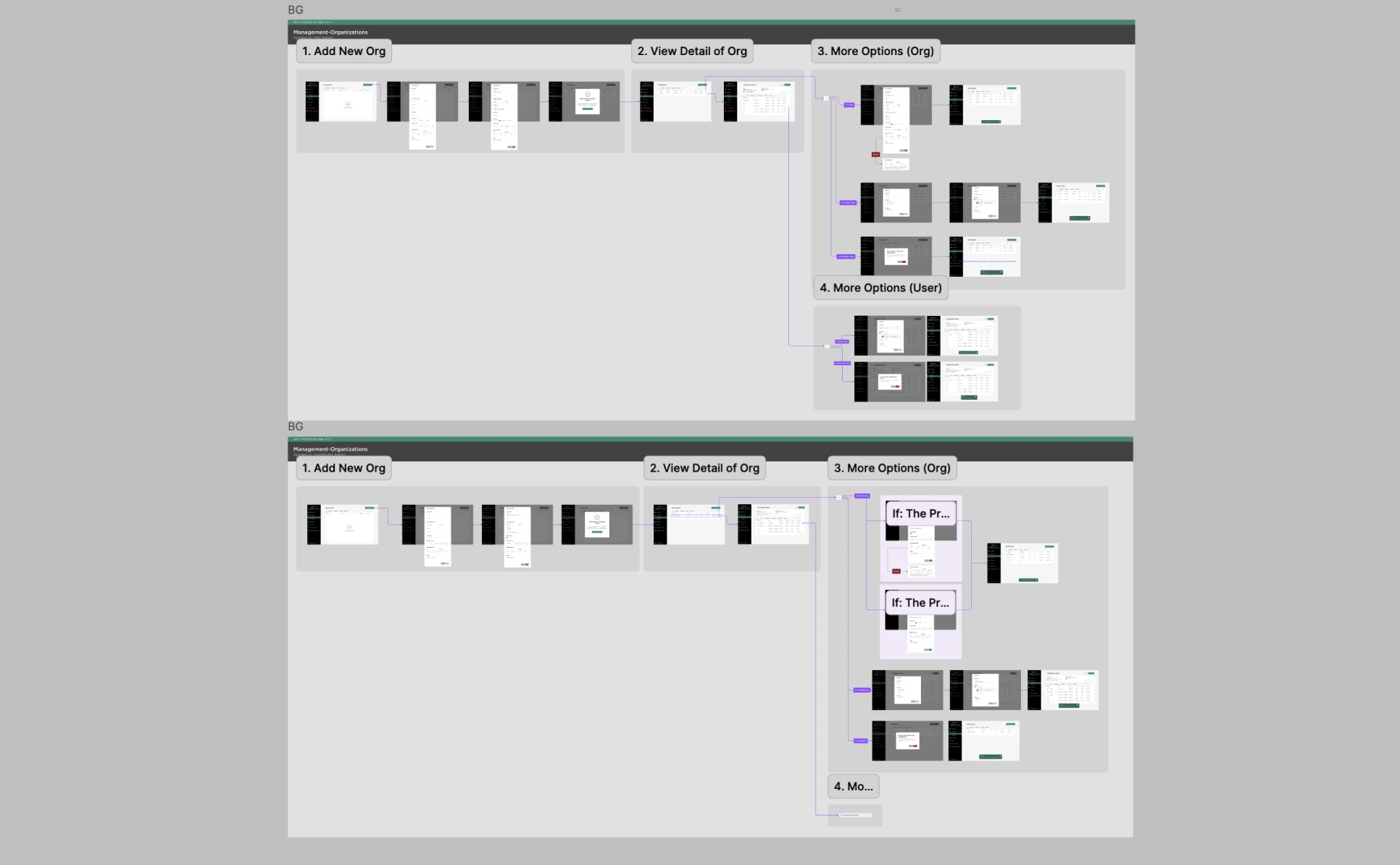
Restructured organization management into clearer, task-specific flows
03 Turn workflows into reusable patterns
I audited existing screens to distinguish patterns shared across the portal from content and behavior specific to a workflow. Shared visual variants lived in the MAI Portal UI Kit; workflow-specific variants stayed in their product files. I documented usage and behavior in Figma and Notion so designers and engineers could apply the patterns consistently.
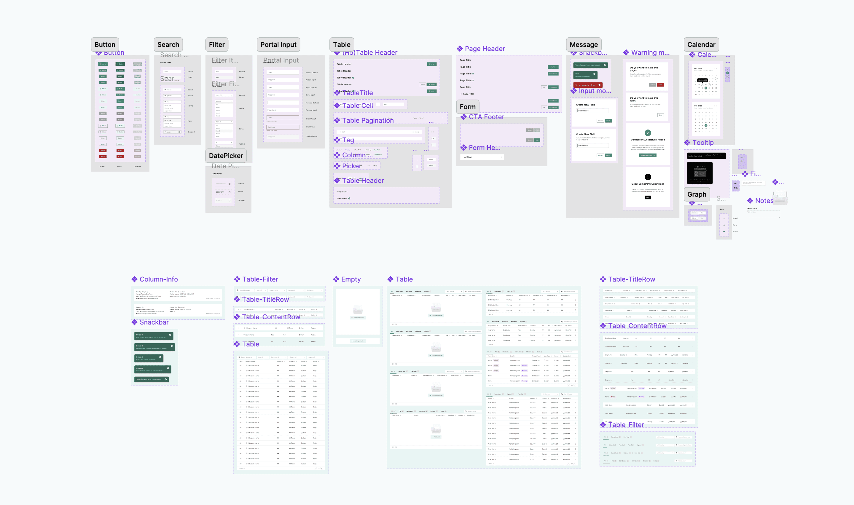
Figma UI kit with shared style variants and feature-specific content variants
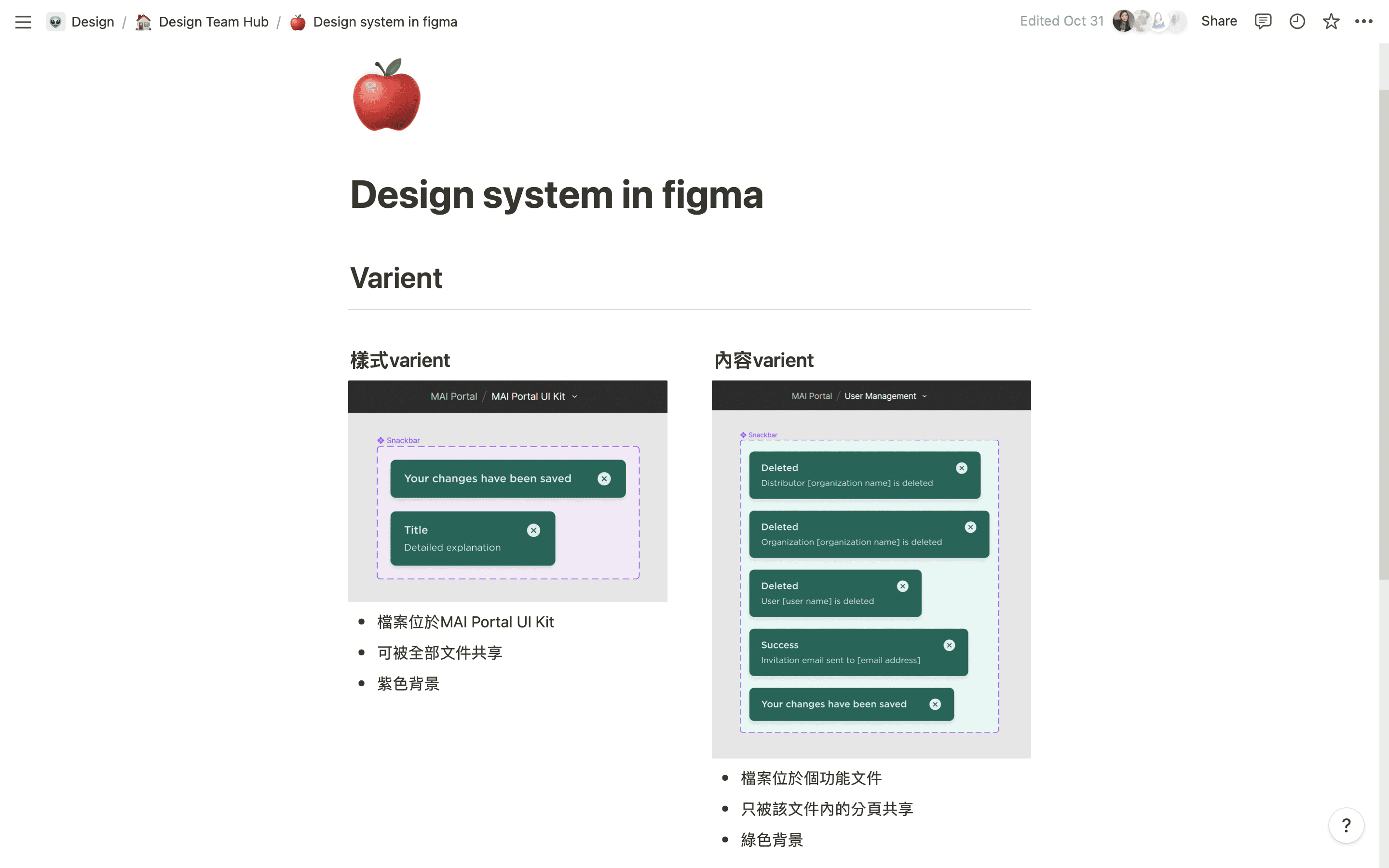
Notion documentation explaining how we organized and used those variants
Reflections