MAI Portal Redesign
Shipped
B2B Portal
EdTech
Designing a Scalable B2B Portal: From Product Logic to a Unified Design System
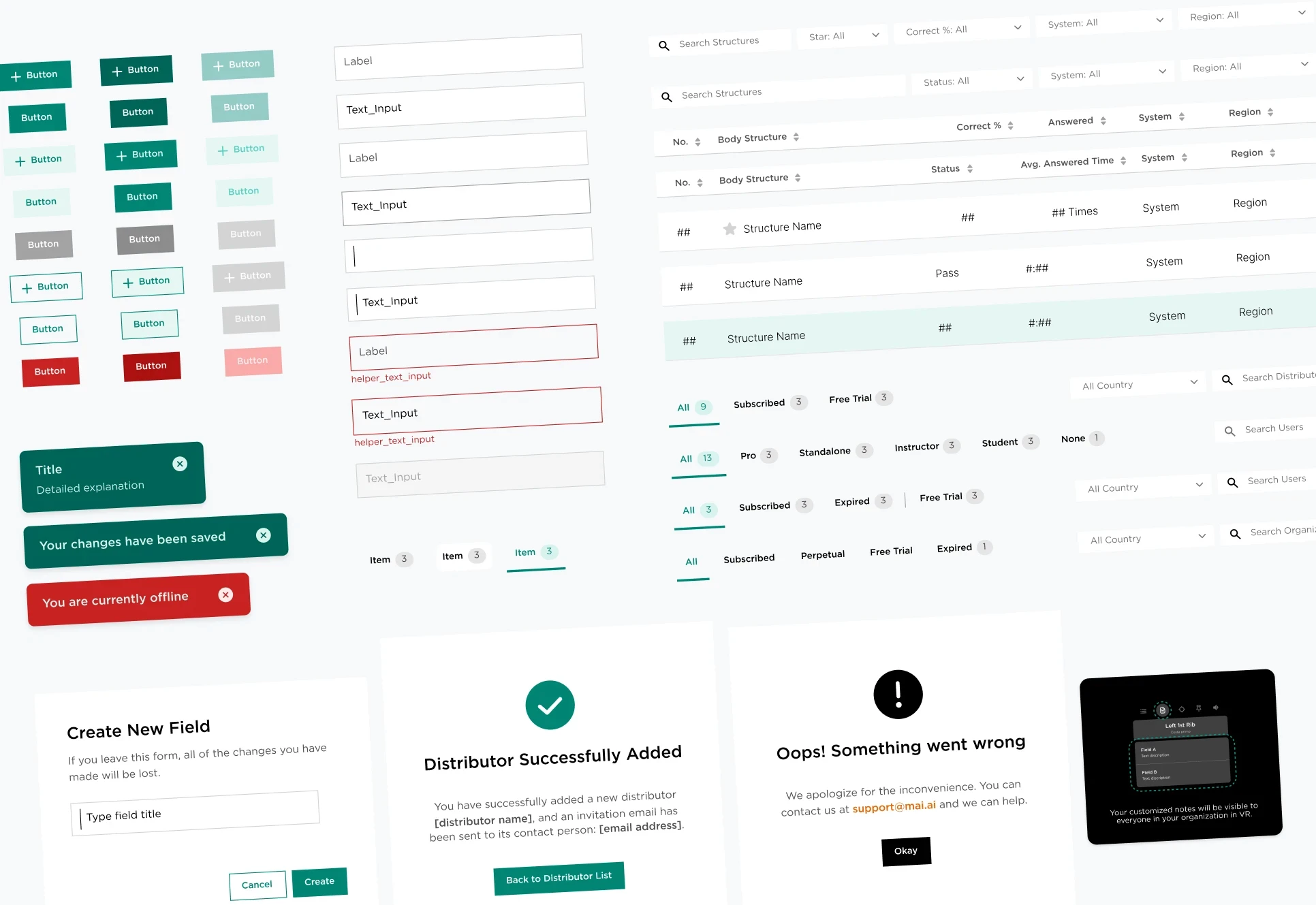
As MAI Portal expanded across institutions, distributors, and individual subscribers, its product logic and interface patterns became increasingly fragmented. I helped clarify roles, permissions, and navigation, then translated those decisions into MAI’s first shared design system.
Developed alongside production features, the system became the foundation for every portal module, helping three designers and engineers ship more consistently with less repeated documentation and rework.
Role
UX & Visual Designer
Team
3 Designers, 1 Frontend Developer, 1 Full-Stack Developer
Duration
3 months (Dec 2022 - Mar 2023)
Scope
B2B Product Design; Design Systems
Features shipped before any shared standards existed
As MAI Portal expanded from a single admin tool into an enterprise platform, new roles, permissions, and features were added without a unified product structure. This created inconsistent workflows, duplicated UI patterns, and an experience that became increasingly difficult to scale.

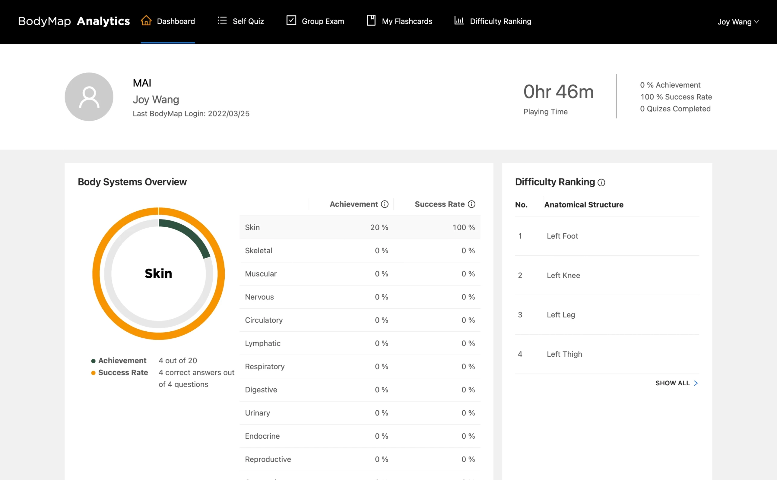
Screens of BodyMap Analytics, before MAI Portal
1
Unclear roles and permissions
2
Inconsistent workflows and UI patterns
3
No scalable foundation for new features
A unified product and design foundation
We clarified the portal’s roles, permissions, and navigation, then translated those decisions into reusable components and interaction patterns. The resulting design system connected product logic with interface consistency, helping the team scale future features more efficiently.
Selected product and system decisions
As we developed new portal features, we made decisions at both the product and system levels. These examples show how we clarified complex product logic while building reusable patterns across the portal.
Product-level decision
Separating capability from role
“Admin” was initially treated as a fixed user role, but administrative access could apply to users across different organizations and subscription plans. We reframed Admin as a capability, creating a more flexible permission model without adding unnecessary roles.
Showing each user what they need
The portal serves four distinct role groups, each with different access levels across organizational and personal plans. Early flows surfaced everything to everyone. We mapped each role's core tasks and built a modular sidebar that scopes navigation to exactly what each user needs.
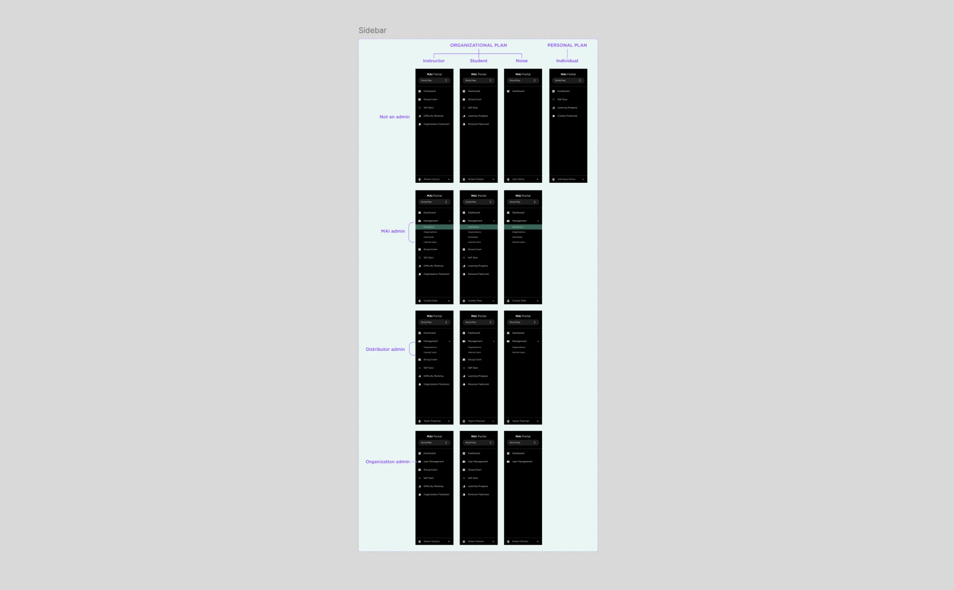
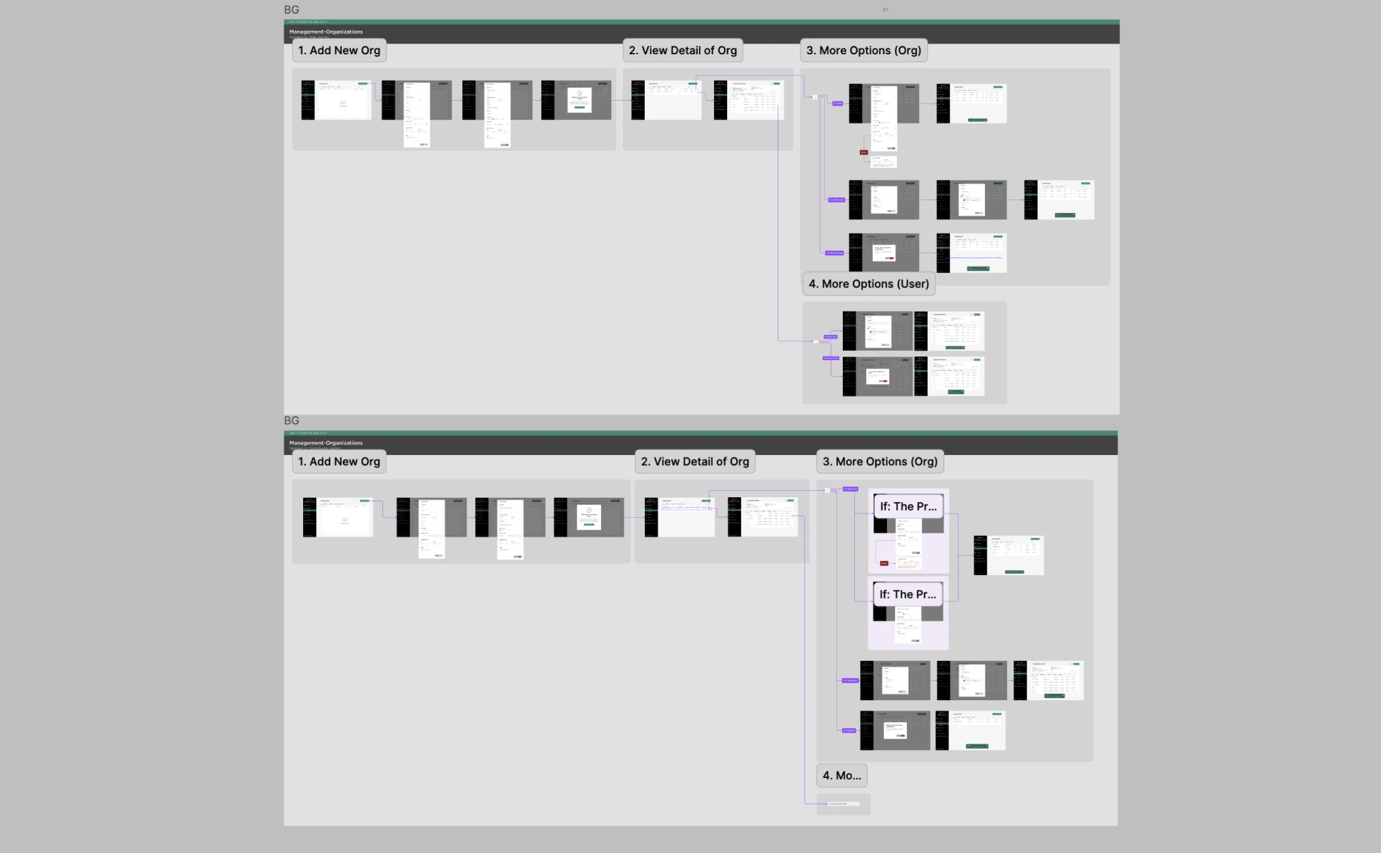
Mapped role-based navigation and restructured dense flows into clearer, task-specific experiences
System-level decision
Balancing global consistency with feature flexibility
We separated the library into shared UI patterns and feature-specific variants. This kept core interactions consistent while allowing individual product workflows to evolve without overloading the central library.
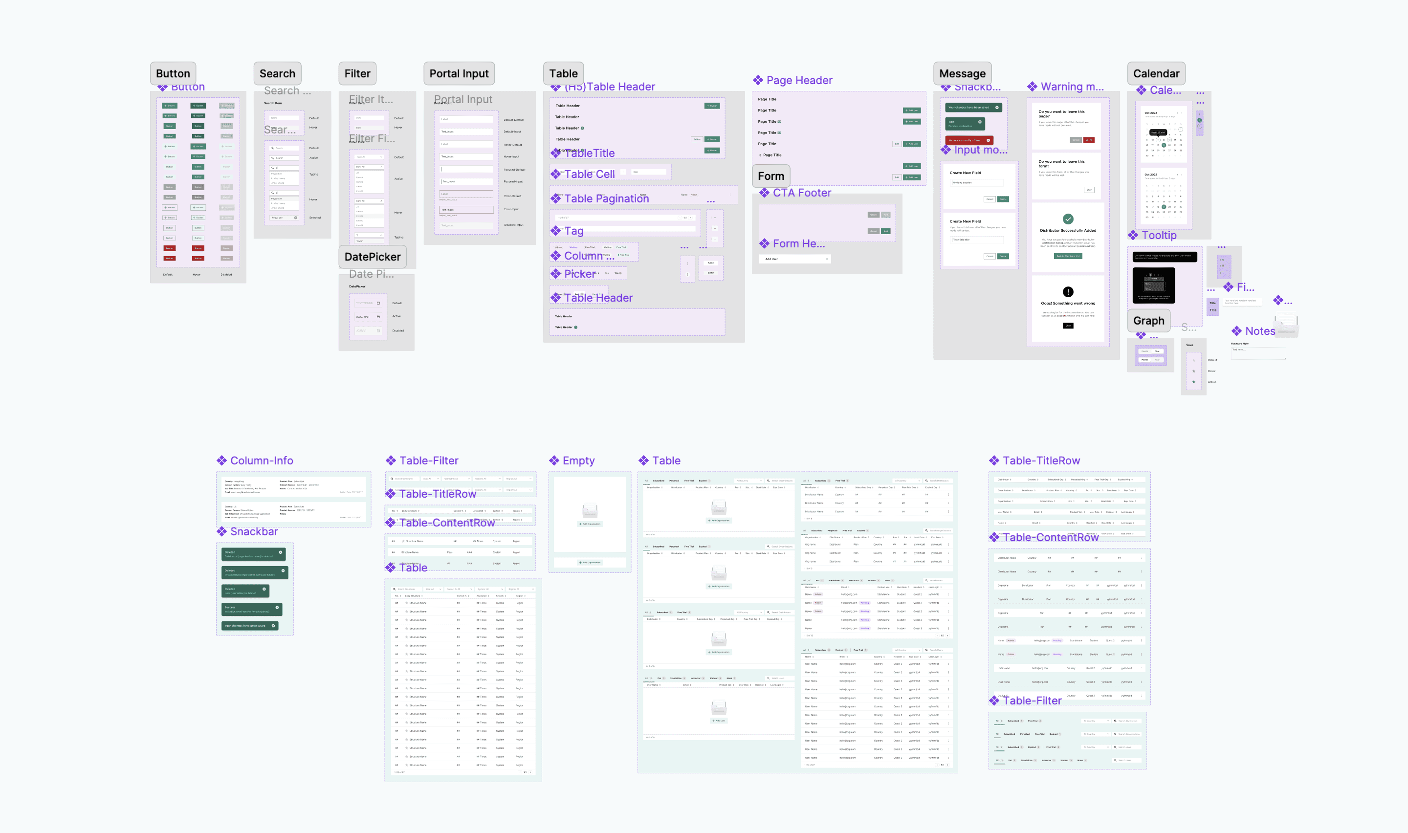
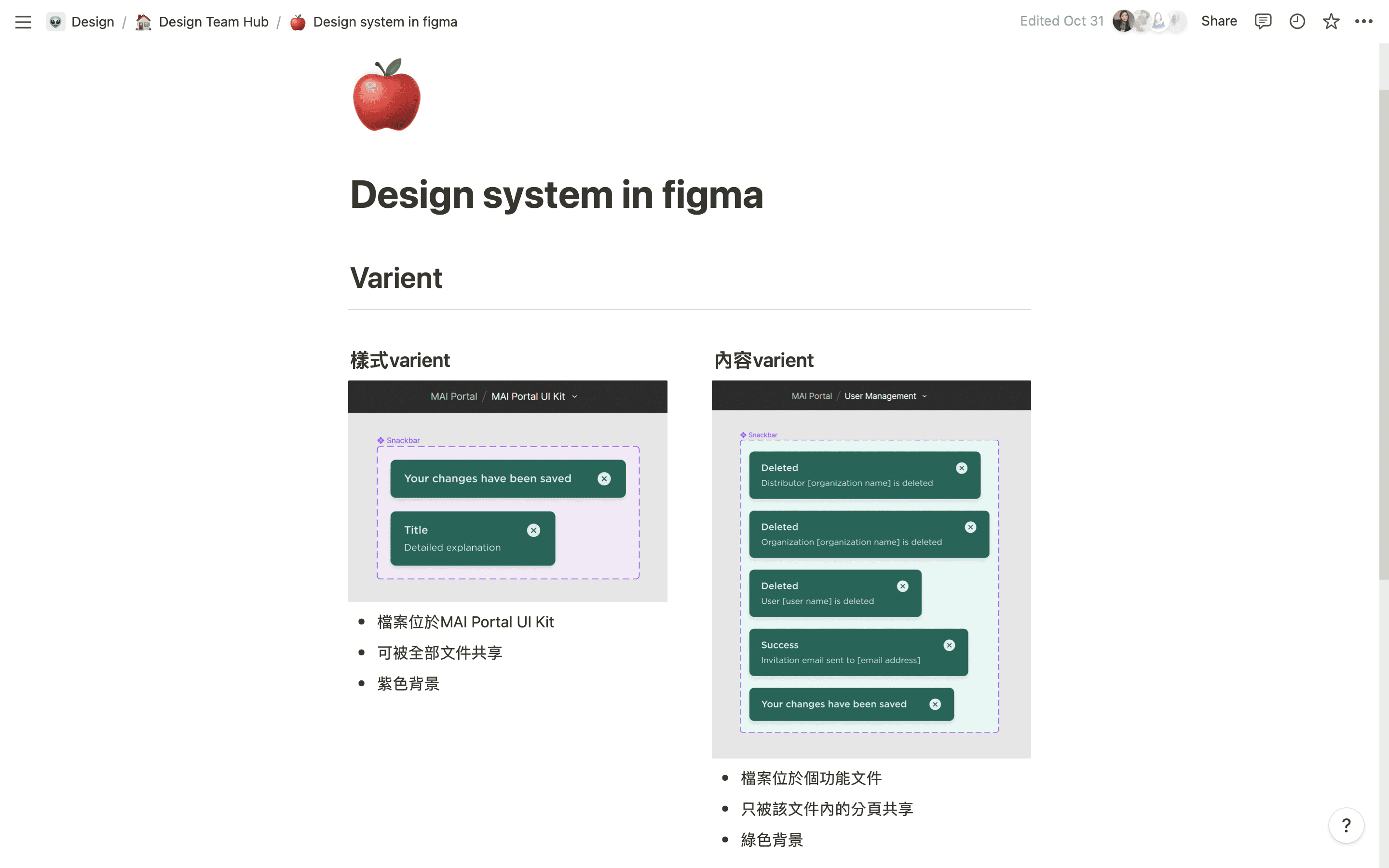
Built a scalable UI kit in Figma and organized components into shared style variants and feature-specific content variants
Turning product logic into reusable patterns
As new features were designed, recurring behaviors—such as permissions, tables, forms, navigation states, and system feedback—were converted into reusable components and documented interaction patterns.
Portal in production
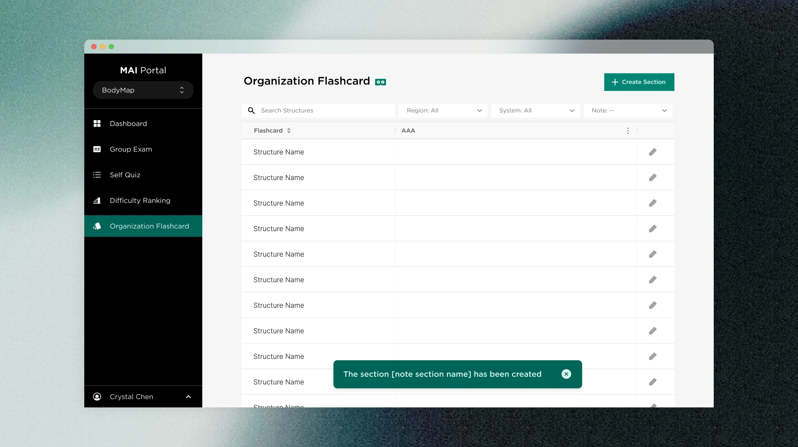
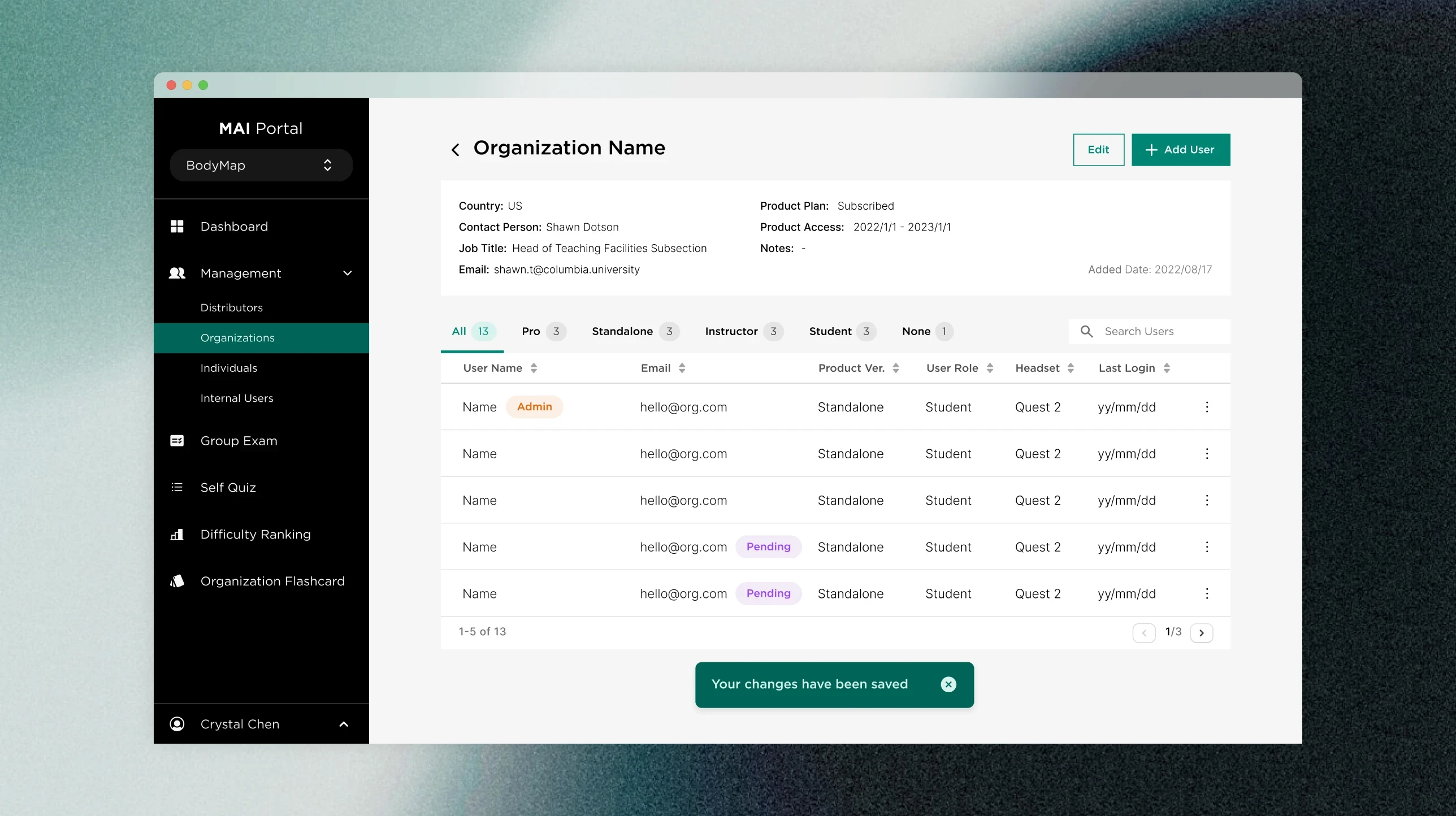
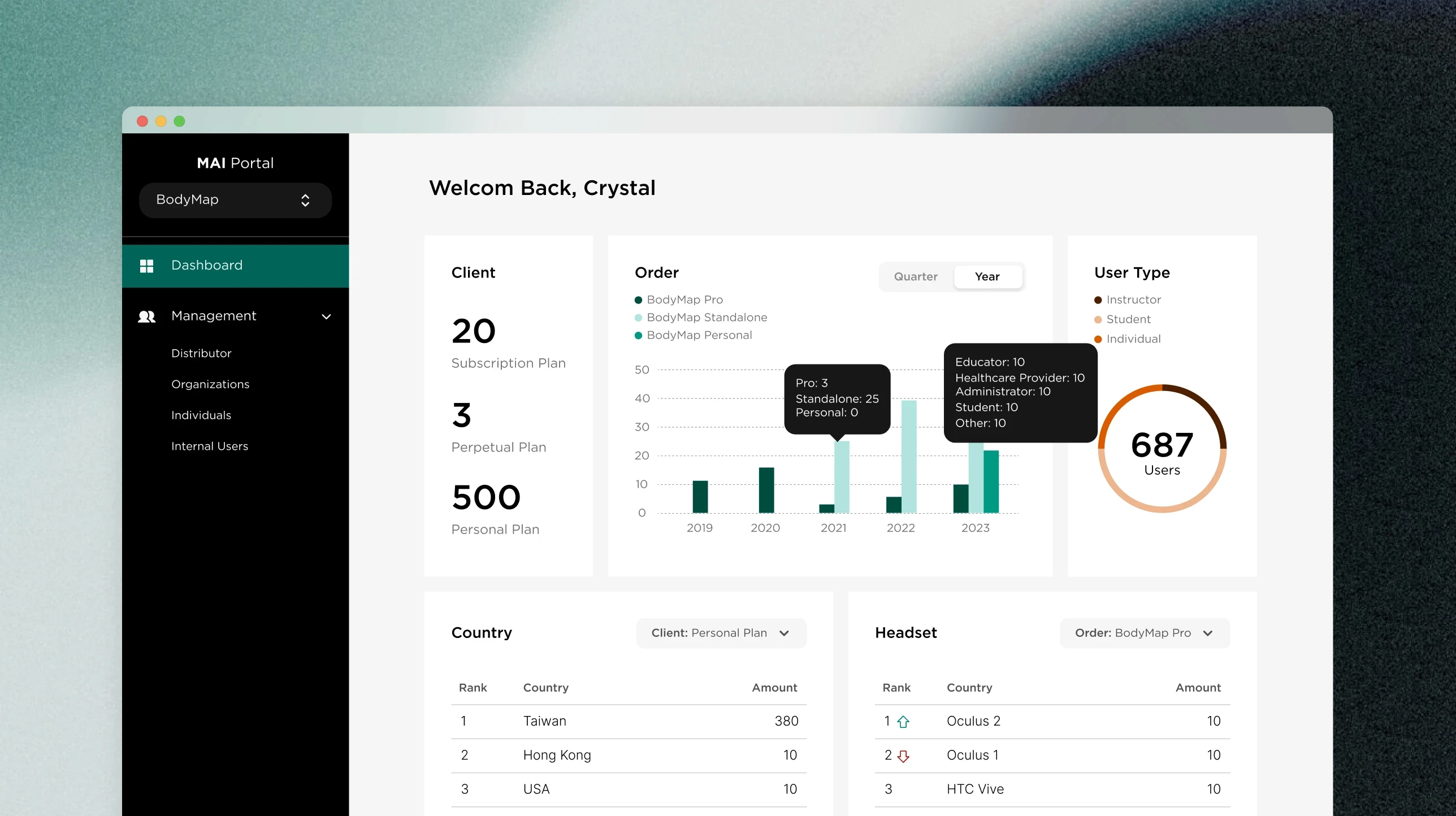

Designing a system inside a startup
Building from zero taught me how to make fast, durable decisions under real constraints.
No token layer, intentional for MVP
With 3 months split between shipping features and the system, a full primitive-to-semantic token structure wasn't feasible. The handoff we shipped was enough for MVP.