Shipped
VR Design
BodyMap VR: Medical Imaging Feature
BodyMap VR: Medical Imaging Feature

Role
Information architecture, wireframing, low- to high-fidelity prototyping, in-headset usability testing
Timeline
Team
Tools
Overview
As a product designer at MAI, I designed a key feature for BodyMap, a VR anatomy platform helping students connect textbook knowledge to real spatial anatomy. By integrating radiographic images with interactive 3D models, we enhanced spatial learning.
The feature launched in early 2023, contributing to broader adoption across educational institutions.
Take a look of video demo: the Medical Imaging feature begins at 00:47. From 00:47 to the end, the video shows the feature I designed for BodyMap VR!
Medical students struggled to connect 2D images into spatial anatomical understanding
Medical students face a persistent cognitive gap: textbook illustrations are flat, but the human body is spatial. Without tools that bridge that gap, students memorize structures without ever gaining practical, clinical understanding.
VR is uniquely suited for spatial learning
By combining radiographic imaging with interactive 3D models, students can visualize anatomy in context, rotate it, explore it, and build genuine spatial intuition.
We achieved
BodyMap’s medical imaging feature is now live, strengthening BodyMap's adoption across educational institutions and expanding access to immersive anatomy learning.
One stakeholder interview question drove the design direction
We ran a rapid audit of existing anatomy tools and spoke with both medical professionals and students to validate the problem space.
Key finding: Learners don't study anatomy by isolated organs. They think regionally, by body area and cross-section.
This insight completely reframed how we thought about information architecture.
Research goals:
Understand how students currently study anatomy with imaging
Identify when in the study process images are most useful
Determine what context (labels, orientation cues, modality type) they need alongside images
Users think in regions, not parts
Our research showed that learners understand anatomy by region—like the digestive system or carpal tunnel—not by standalone organs. To support this, I restructured how users access medical images within the VR experience.
We then explored how best to integrate this feature into the existing interface:


From floating cards to a focused, image-first MVP
To guide the early experience, we created the user flow, information architecture, and wireframes in Figma.
The initial concept used a Floating Card layout to present anatomical details, including definitions, images, and clinical relevance, with expandable dropdowns to reduce visual clutter.
Through VR testing, we found that too much text disrupted the immersive experience. We then refined the MVP to focus on medical image viewing, creating a clearer interaction flow and better spatial usability in 3D space.
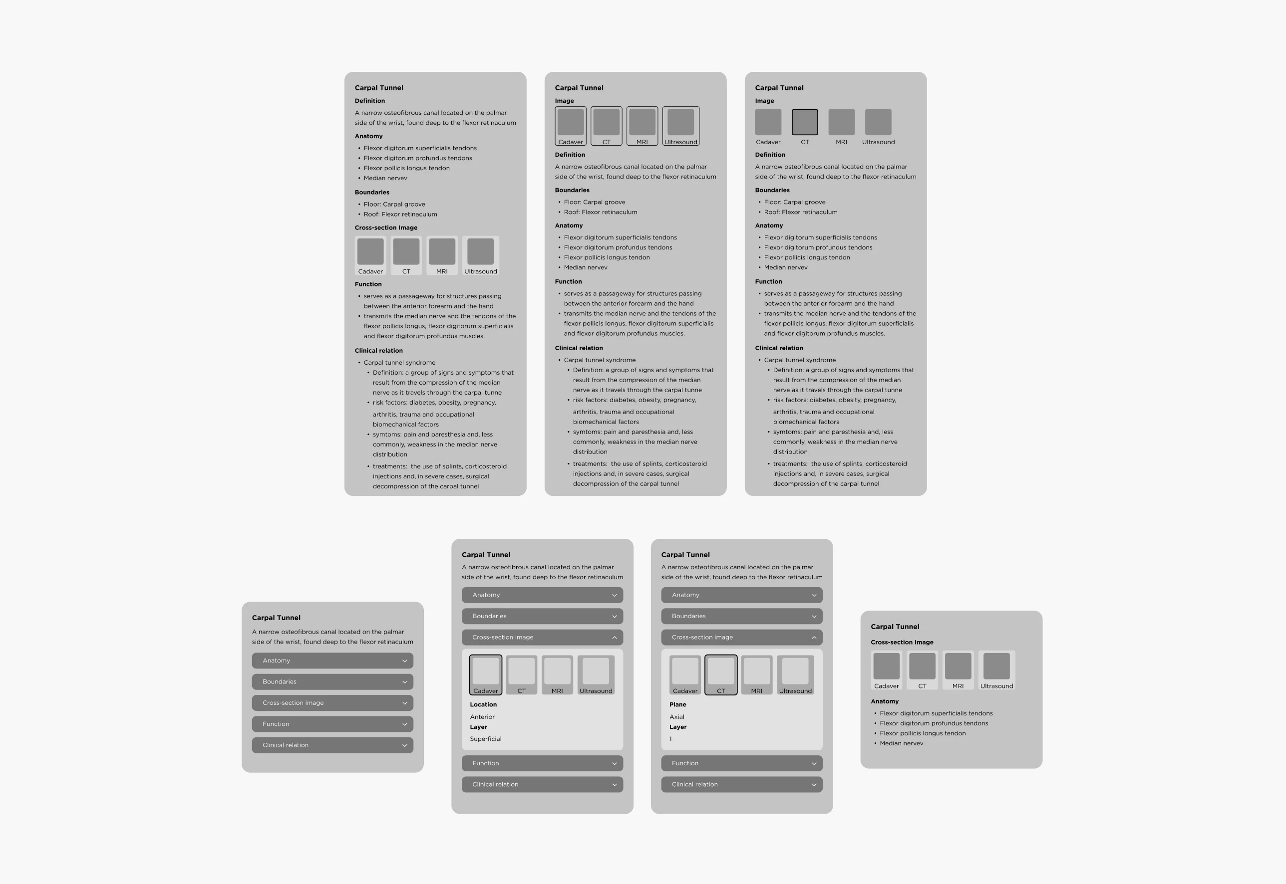
Organizing Medical Images for Spatial Learning
To improve navigation and spatial understanding, I organized medical images by anatomical region and modality. They were divided into:
Cadaver images: realistic tissue references
Radiographic images: CT, MRI, and ultrasound scans for cross-sectional views
I also introduced a cube-view indicator to show each image plane in 3D space and ensured every image was clearly labeled by region and type.
This helped learners study anatomy by area, switch between image types, and build stronger spatial understanding.
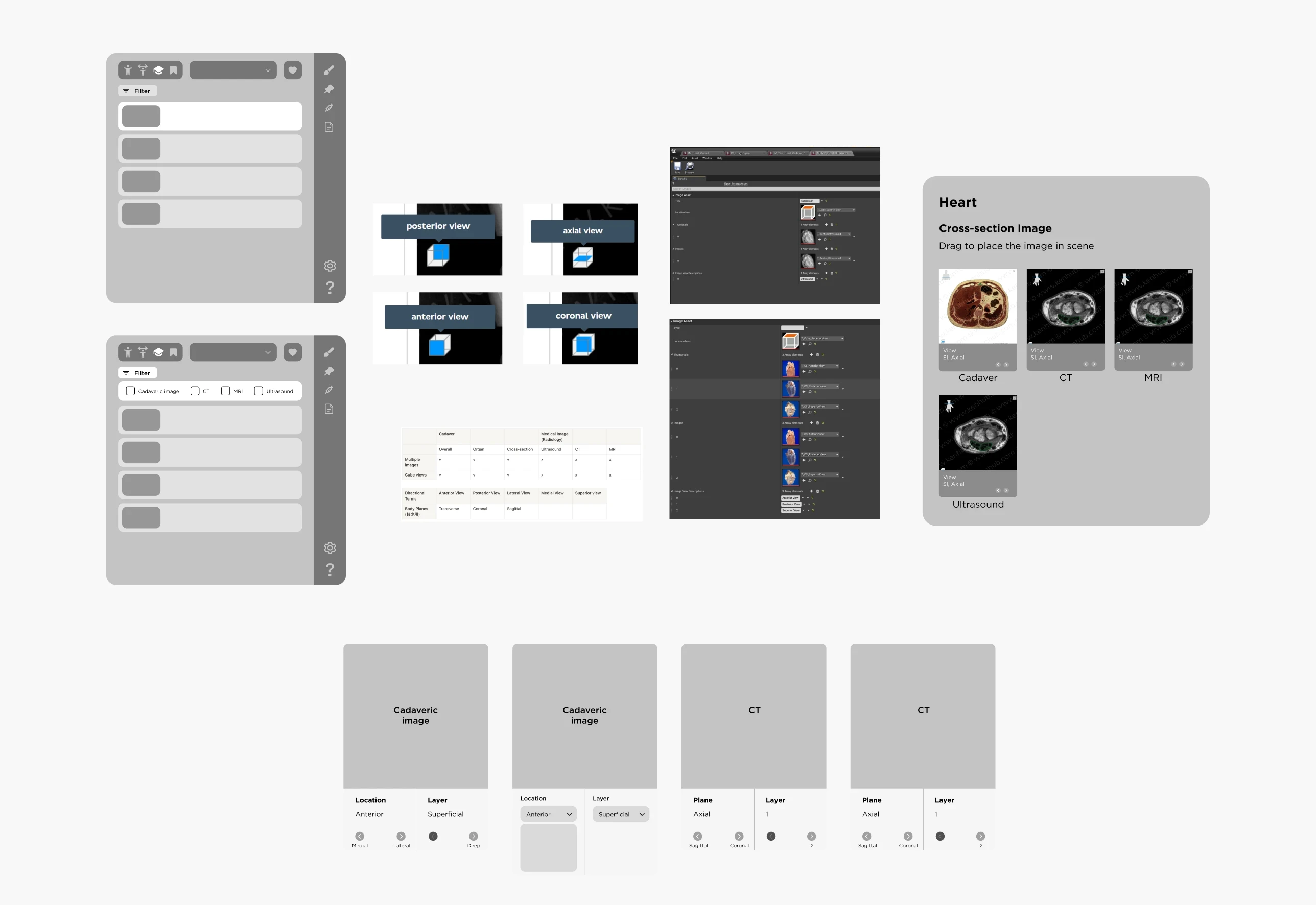
After finalizing the layout, our developer and I prototyped it in Unreal Engine. I then refined the UI and conducted in-headset testing to fine-tune spatial usability.

In-headset prototype testing in Unreal Engine to refine spatial layout and interaction usability

Final BodyMap VR interface showing library menu and main medical imaging panel
Reflections
Designing for VR taught me how fundamentally different immersive interfaces are from traditional 2D design. I had to think about 360° environments, which open up more possibilities, but also add complexity.
One key challenge was no established UI guidelines for VR. We built our own, testing directly in Unreal and scaling elements in Figma to ensure they worked in 3D space. I also realized that accessibility in VR is still underexplored: something I plan to prioritize more in future projects.
Another takeaway was the importance of bridging communication styles across disciplines. Using visual tools like annotated flows and diagrams helped align developers and stakeholders and made collaboration much smoother.
About the Team
Big thanks to the team!
Guidance from Lili Huang and collaboration with Angel Chang shaped this project into what it became.
Lili provided direction and feedback while giving us space to brainstorm and explore. Angel’s psychology knowledge and systems thinking helped keep the features grounded.
Special thanks to Crystal Chen and Lukáš Vilím for supporting UX writing and bringing the design to life in VR!


